

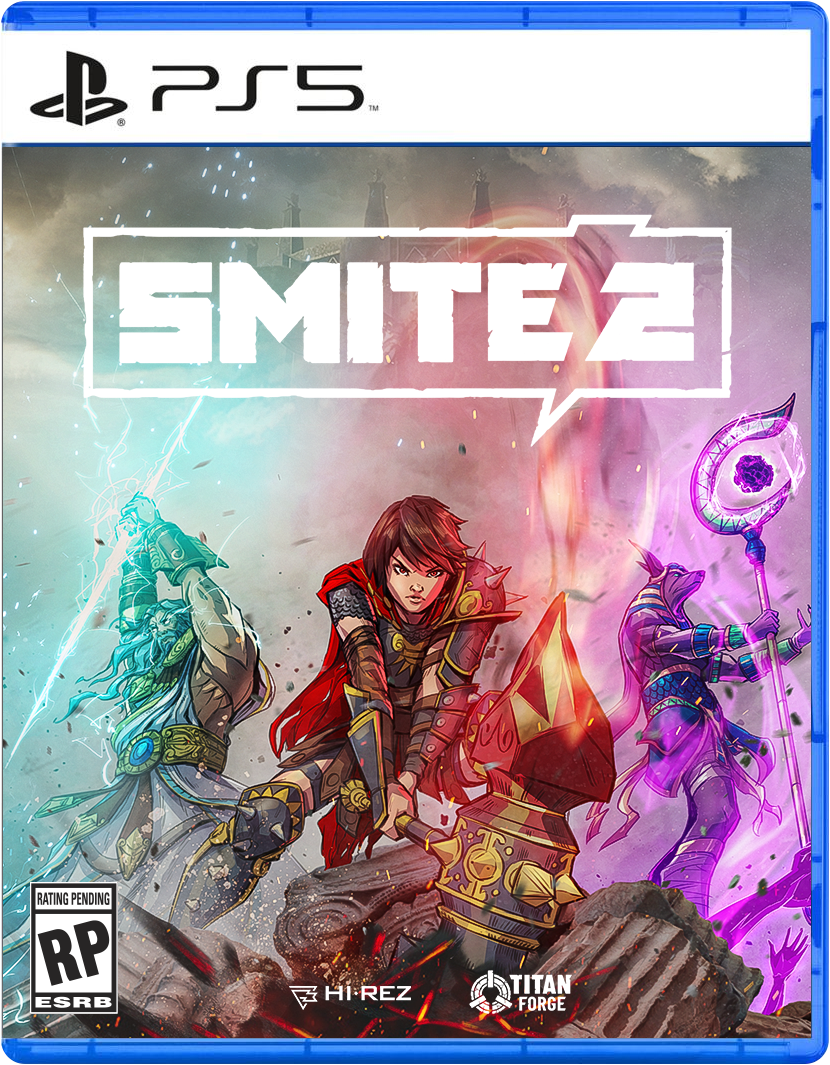
The creative idea I proposed was a simple yet impactful message that Smite 2 is still the Smite you love to play but "beyond" in every way. I wanted to go brighter and whiter on the overall color palette (for marketing materials) as a fresh new take for the sequel. While this might make logo placement more difficult, I thought it was a refreshing way to showcase the upgraded visual effects in the game.
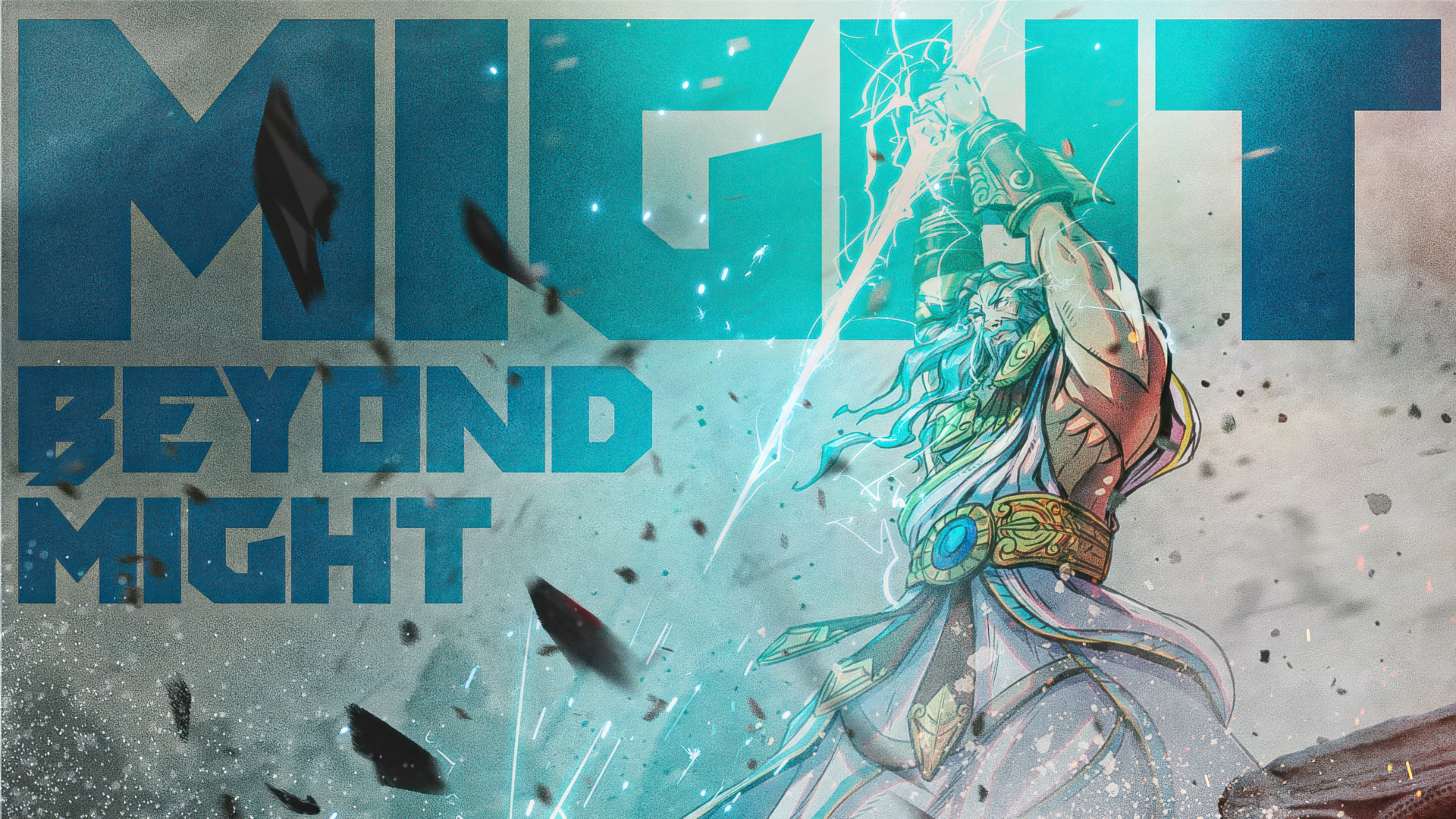
A trio of popular characters is used for the primary key art to show character and power diversity. Each character is separated by their respective zone of color created by the lighting effects of their unique abilities against the dense fog of war.

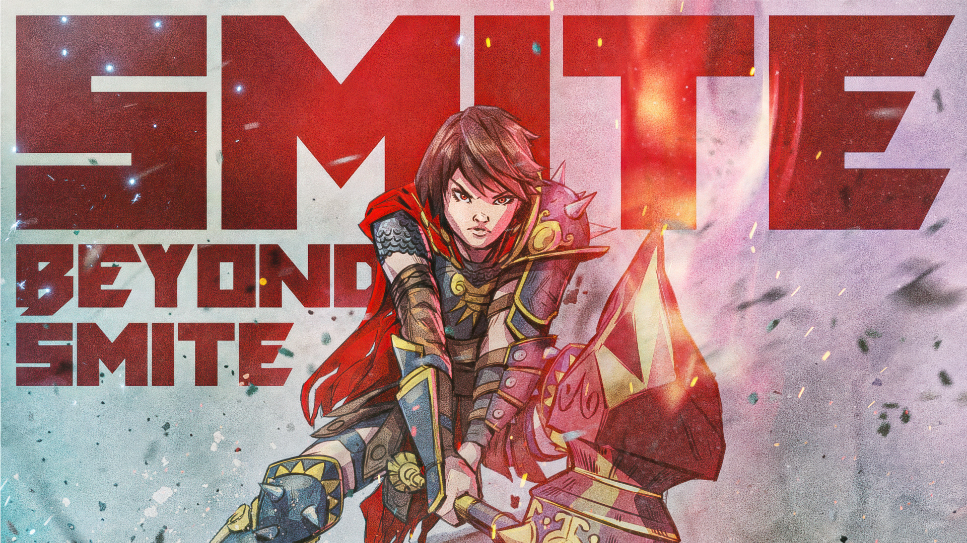

Alternate pose for Bellona.
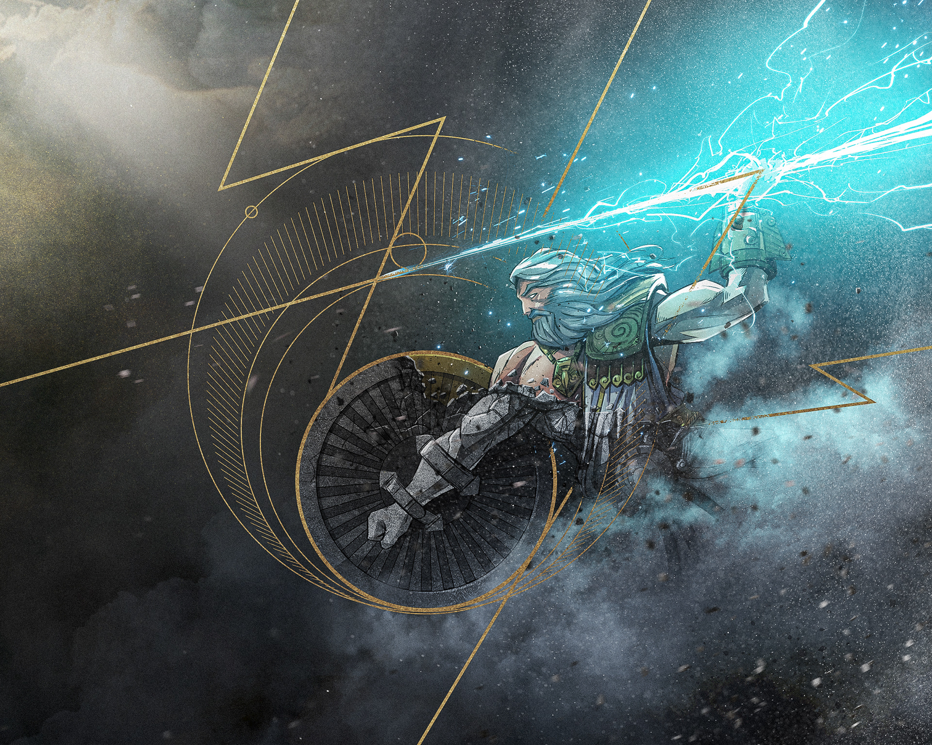
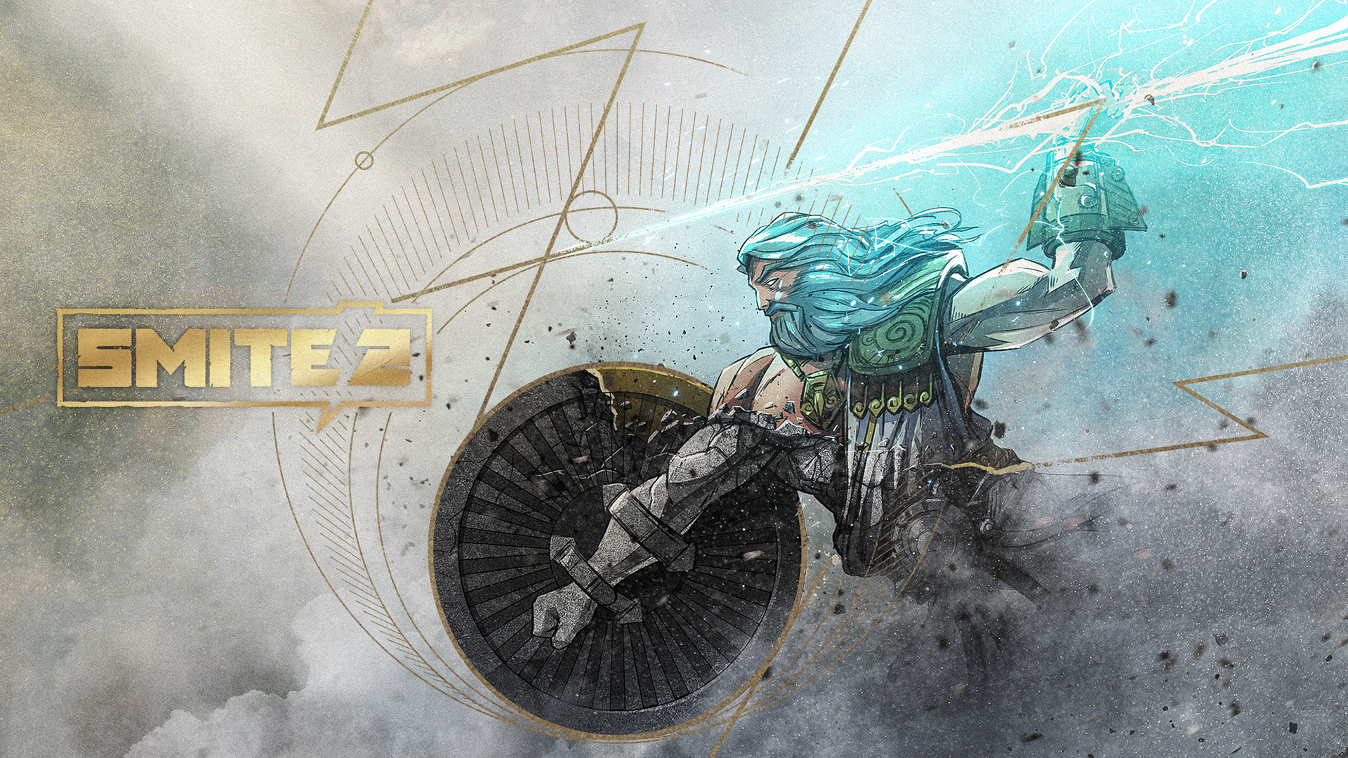
Secondary character key art concept below, using a visual language I called Divine Deco.

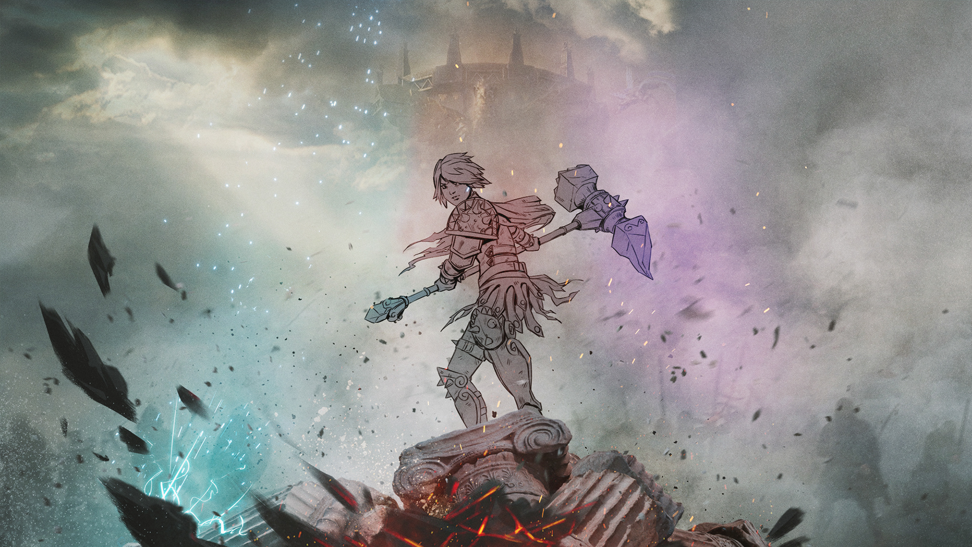
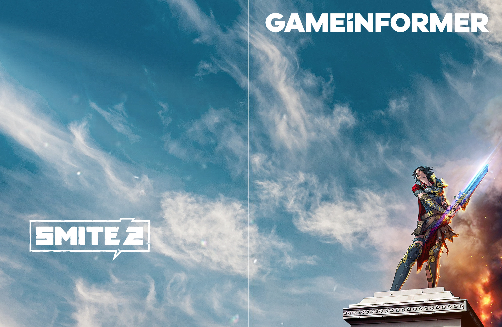
Super minimal mock Game Informer cover below showing a victorious Bellona with a hint of the aftermath of battle.
Bellona is posed on a pillar similar to famous Greek and Roman statues. The slight up-shot is how many statues are seen from our own vantage point on the ground. Sometimes an idea isn't explored because it's super obvious. But I think obvious ideas and compositions can often be the best ones.
Credits /
Client: Hi-Rez Studios
Concept, Creative Direction, and Illustration: Charles Bae